ProVitaTec · App UI · 2021

Making a safety app feel safe

A clearer settings interface for the app behind the Sens07 rescue vest, so freedivers and spearfishers feel informed and safe instead of uncertain.

Client
ProVitaTec Ltd, Switzerland
My role
UX / UI Designer (remote consultant)
Team
Together with the founder of ProVitaTec
Year
2021
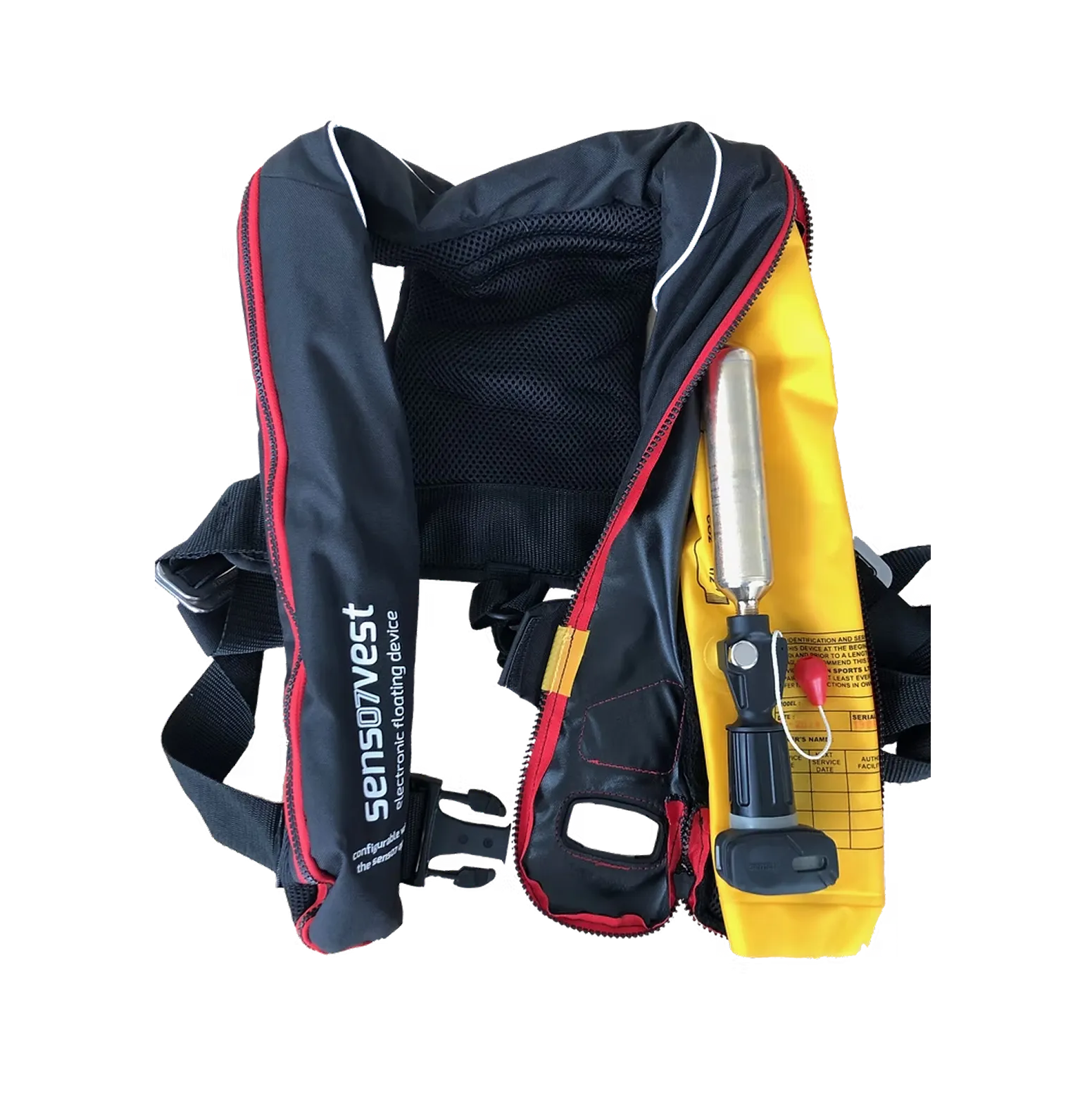
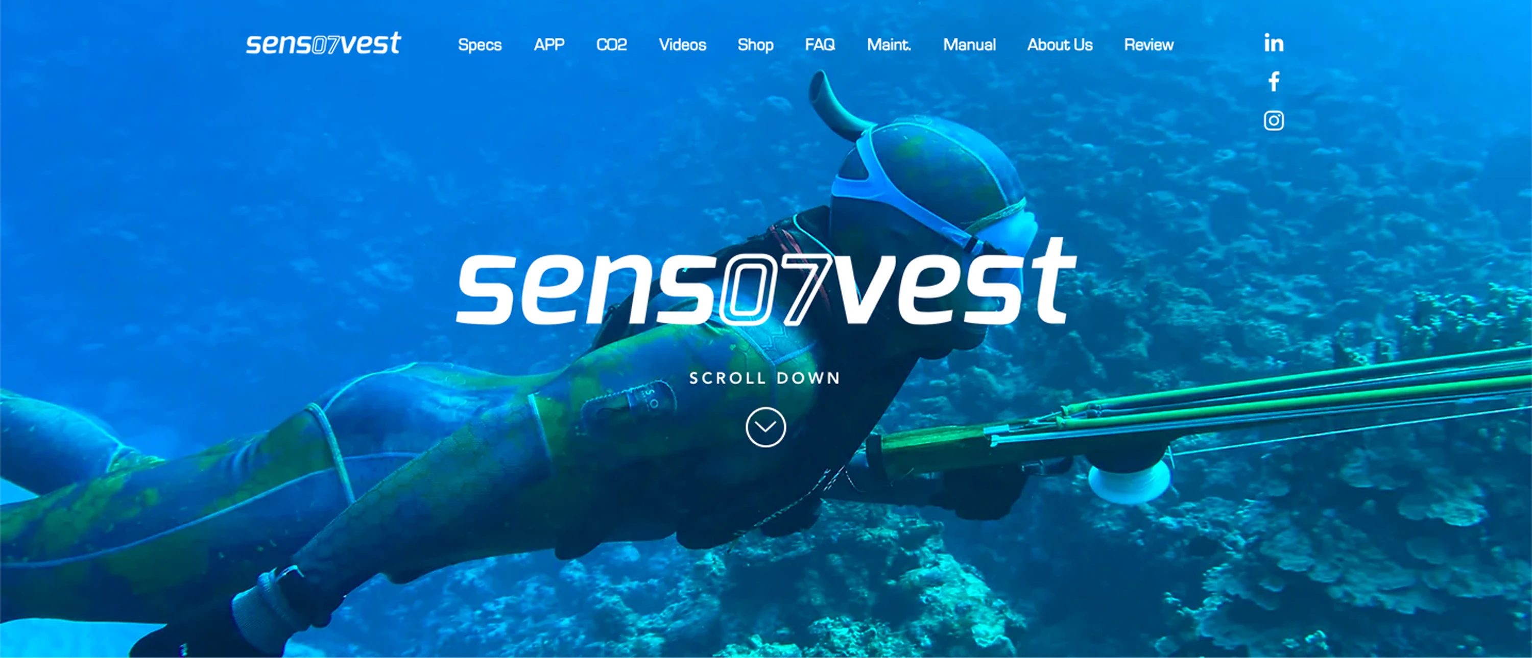
The Sens07 website with the rescue vest

Client & vision

ProVitaTec is a Swiss electronics engineering and manufacturing company, founded in 2009 by two high-tech enthusiasts with a passion for the underwater world. It aims to reduce drowning accidents in sports like spearfishing and freediving.

The Sens07 vest is an inflatable rescue system that senses depth and time under water. Its settings are configured in the Sens07 app.

Business goals:

  • Improve safety for water sports enthusiasts and professionals with smart electronics
  • Become well known, common safety equipment for spearfishers and freedivers
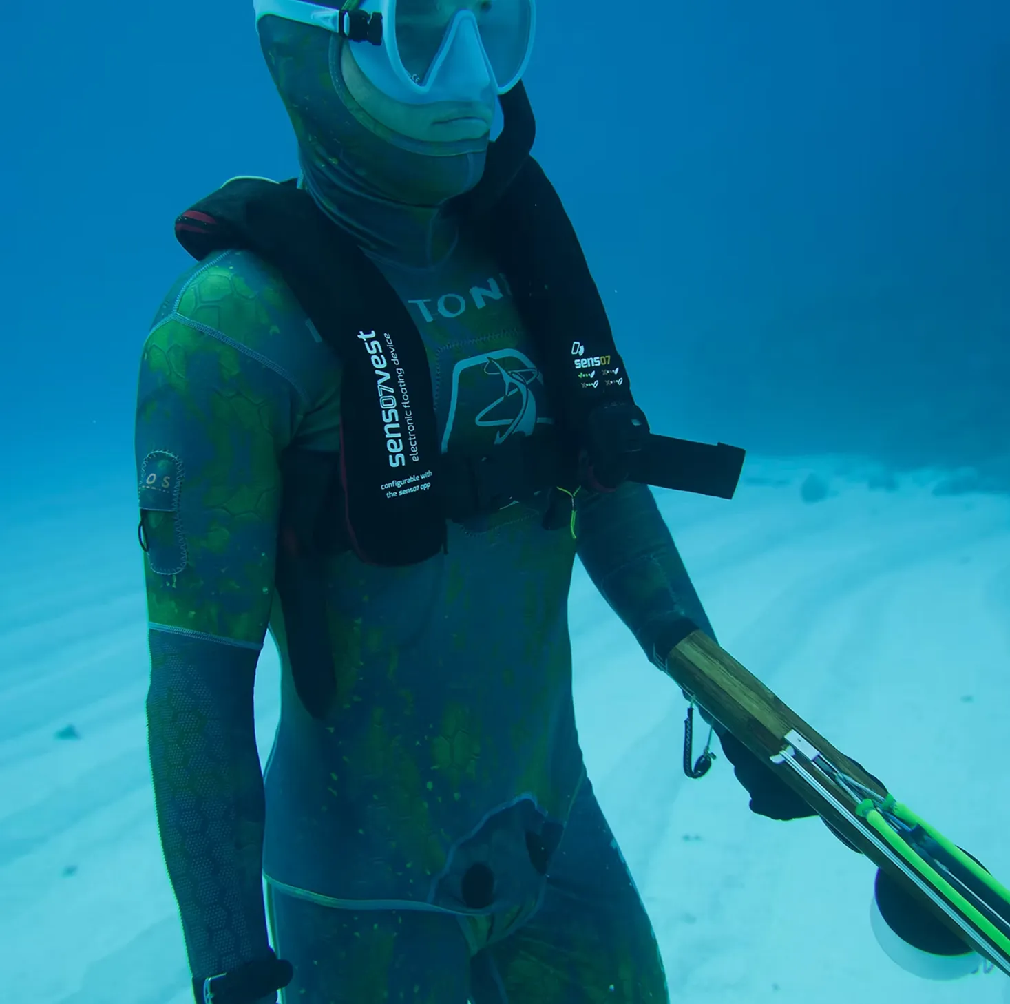
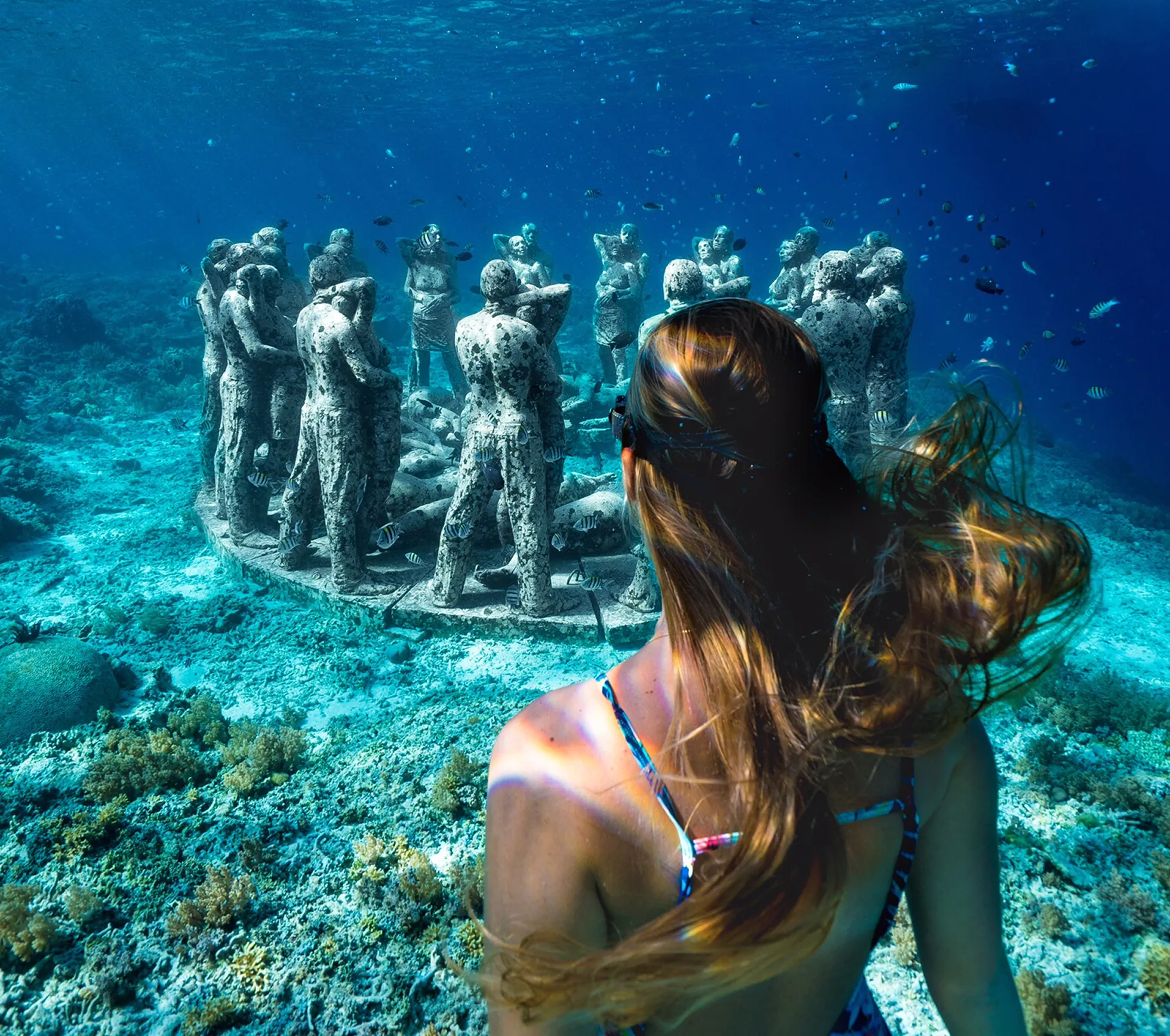
A spearfisher wearing the Sens07 vest under water
The Sens07 rescue vest
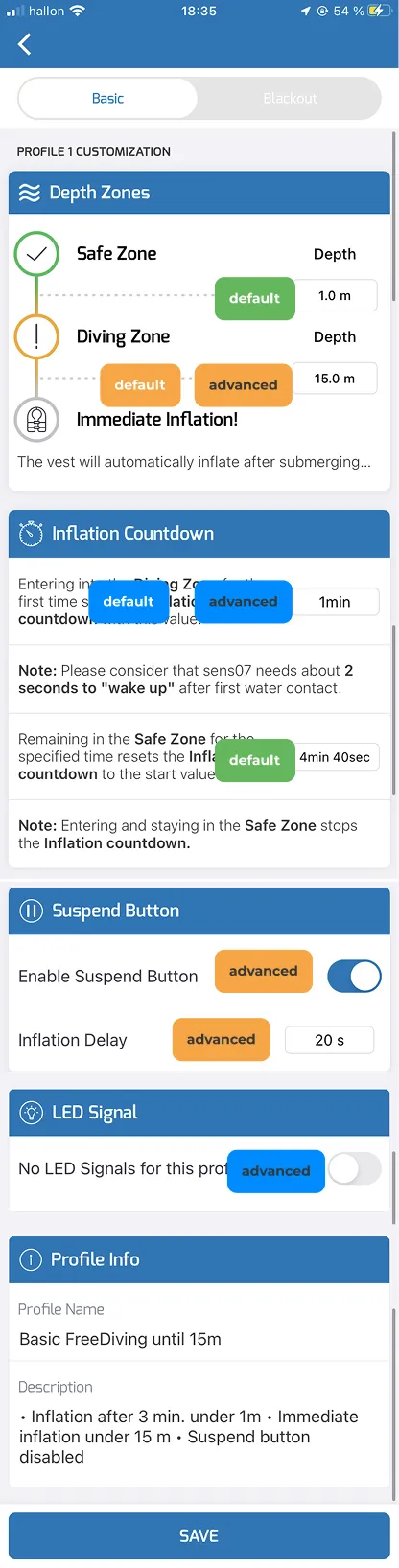
The settings of the Sens07 vest are personalised in the Sens07 app.

Problem statement

The founder of Sens07 was receiving frequent support requests because users didn’t understand how to configure the app’s parameters. The interface was technically functional, but unclear, unintuitive and designed from an engineering perspective rather than a user perspective.

As a result:

  • Users struggled to understand which parameters they needed to set.
  • The UI didn’t clearly communicate the meaning or effect of the settings (e.g. inflation countdown, recovery countdown, suspend time).
  • The app allowed unrealistic or confusing values (e.g. 4-hour dive times), which increased misunderstandings.
  • The manual and in-app guidance weren’t enough, forcing users to rely on support.

This created several operational problems for the company:

  • High support load from confused users
  • Reduced usability and customer satisfaction
  • Risk that users misuse or misconfigure a safety device, which is especially critical for freediving equipment
  • A poor onboarding experience, which likely affects product adoption and trust

Problems summarized:

  • High customer support load
  • Users reported that the app was unclear, which made them feel uncertain instead of safe, defeating the purpose of the product

Goal

  • Improve the clarity and usability of the app interface without a full rebuild or advanced programming
  • Make the parameters understandable through better UI structure and visual communication
  • Introduce better limits and logic for what users can enter
  • Align the app, manual, onboarding materials and App Store presentation with a clearer user experience
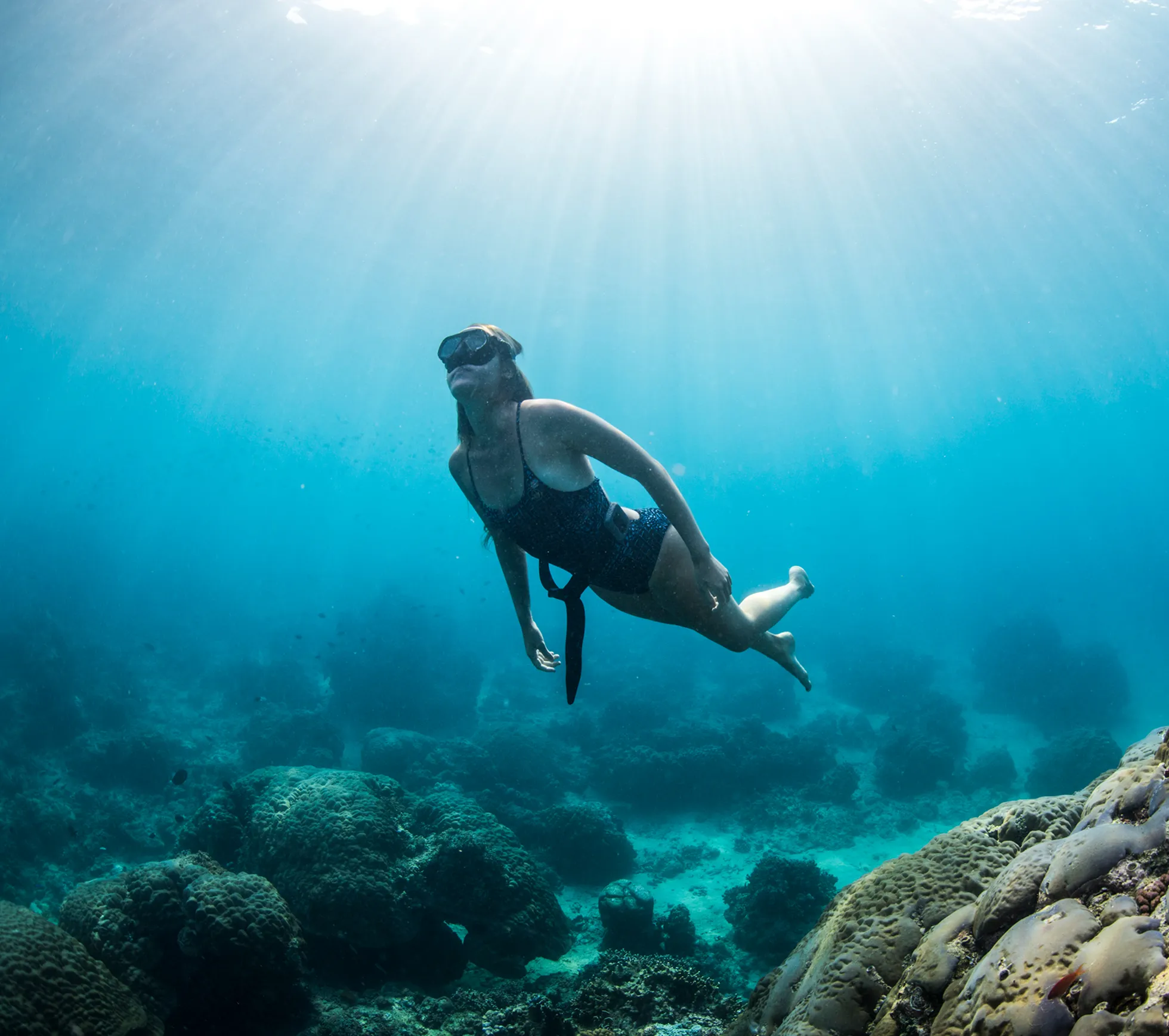
Sofia freediving Sofia freediving in open water
I was contacted by the founder for my freediving knowledge, from working full time as an instructor in Indonesia and freelancing for the renowned freediving equipment brand Molchanovs. Photos: Adam Stern (left) and Alex Kydd (right).

Process & strategy

  1. Plan & define

    • Get clarity on business goals and vision
    • Define the problems we’re solving
  2. Discovery & research

    • Desk research
    • Gather data
    • Look through previous feedback
  3. Early testing

    • Get live feedback on the user interface
    • Proof of concept
  4. Information architecture

    • Get a deep understanding of the app and its functions
    • Map out and restructure how the settings are organised
  5. Hi-fi UI design

    • Iterate on the best user flow
    • Create a high-fidelity UI design
  6. Final presentation & handoff

    • Present the design, thought process and key takeaways
    • Hand off design files and make sure the client is clear on everything

Brand guidelines

The colours I worked with were based on the brand colours and style guide of the existing website.

  • Call to action / Warning / Inflation

    #F6A646

  • Call to action / Success / Reset

    #65B75D

  • Profiles / Diving zone

    #008BFD

  • The Sens07 app logo
  • Text / Header / Tab bar

    #353535

  • Buttons / Info icon

    #C7C7C7

  • Sections

    #FFFFFF

  • Background

    #FAFAFA

Simplifying settings

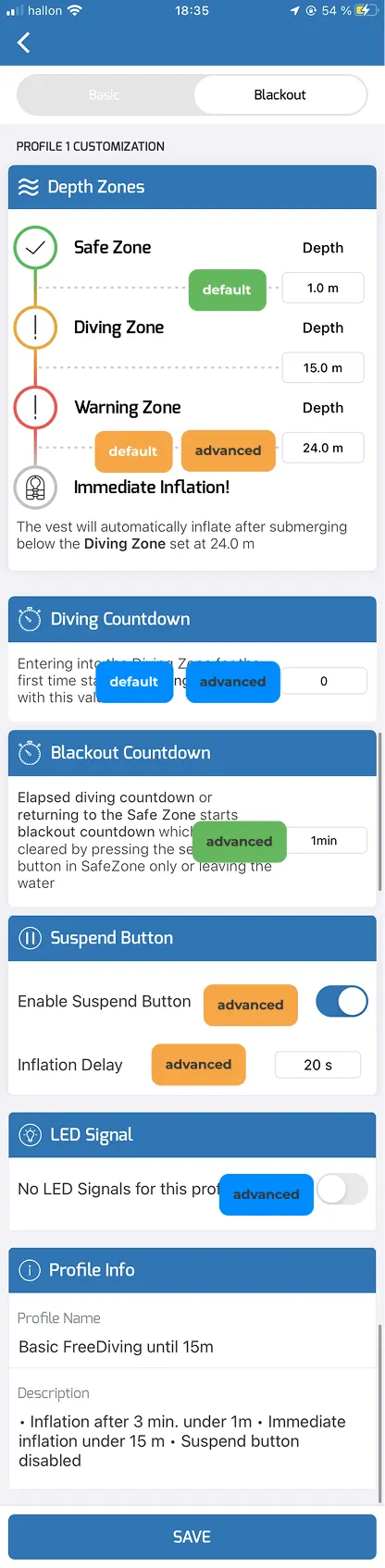
What I considered one of the main reasons for confusion was the profile customisation page. Here the user had to choose between “Basic” and “Blackout”, which led to separate pages.

First, I renamed Basic to Default and Blackout to Advanced.

To create a more intuitive UI, I wanted to merge these separate pages into one, and show the settings in an easier and more accessible way.

To do this, I sorted the settings into three groups and then mapped them out over the previous UI.

The settings sorted into three groups on the previous interface The three groups mapped out over the previous profile pages

Result

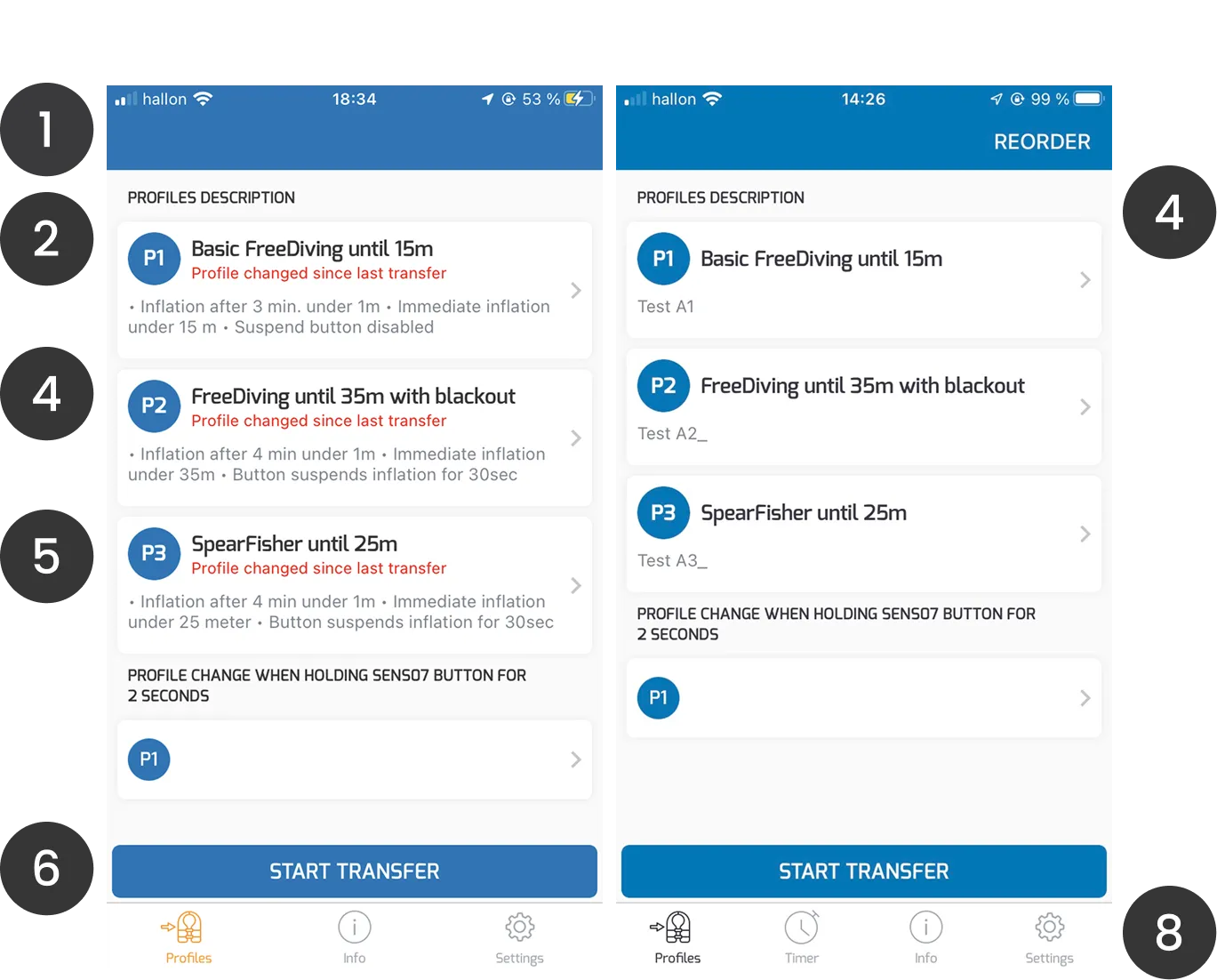
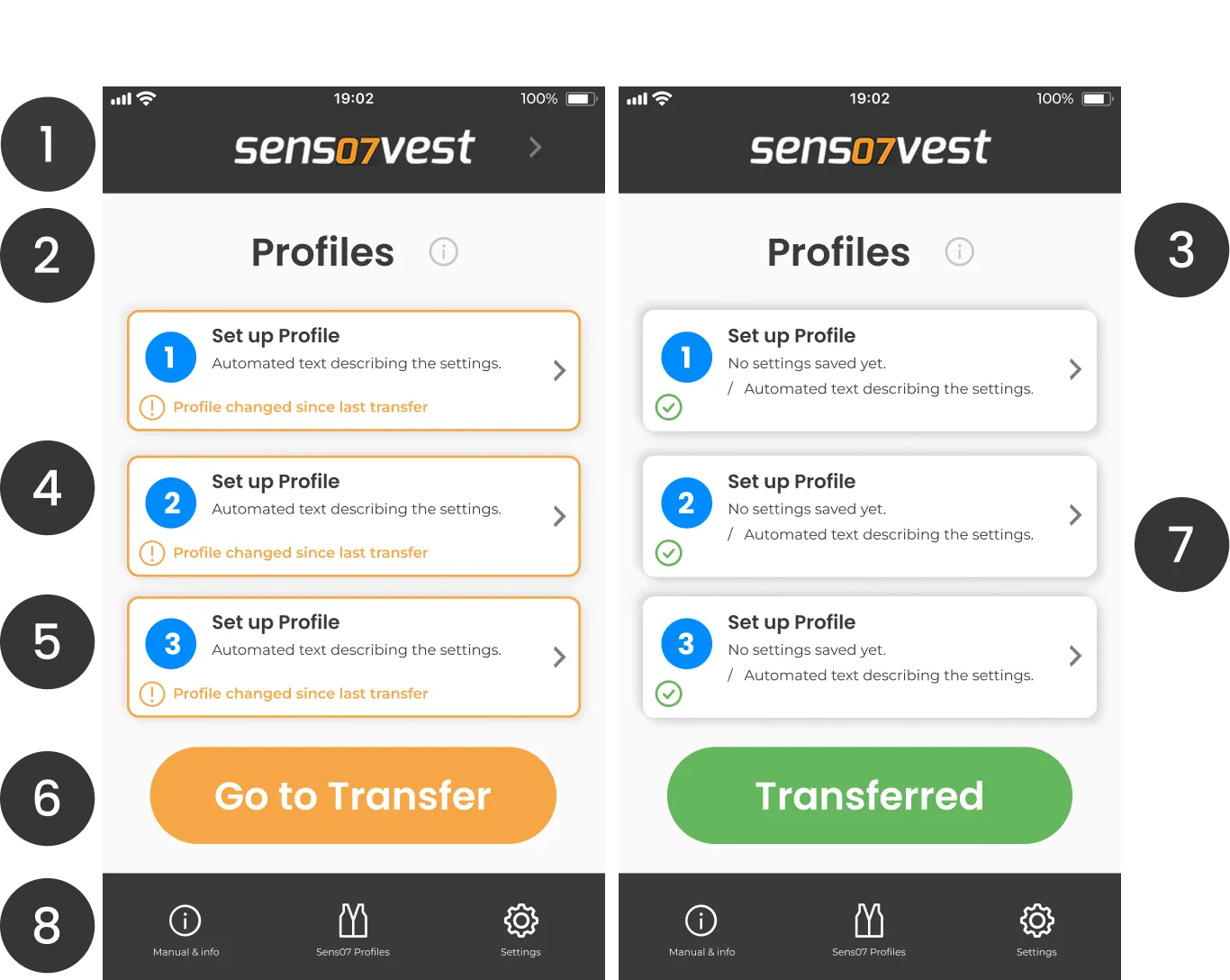
Start page / profiles overview

  1. The header and tab bar now use the same black as the app logo, and the logo sits in the header for stronger branding.
  2. A larger headline for better visual hierarchy.
  3. An info button on the start page helps new users find their way.
  4. Pre-made names like “Basic FreeDiving until 15m” became “Set up Profile”, so users understand they can customise them.
  5. Orange instead of red for warnings (red is saved for errors), with an orange outline on profiles that aren’t transferred yet.
  6. A larger orange “Go to Transfer” button guides users to the transfer page, and a green “Transferred” button shows when the settings are updated.
  7. A green checkmark shows that profiles are transferred.
  8. A larger tab bar that’s easier to use.
The previous start page, with numbered changes
The new start page with the profiles overview

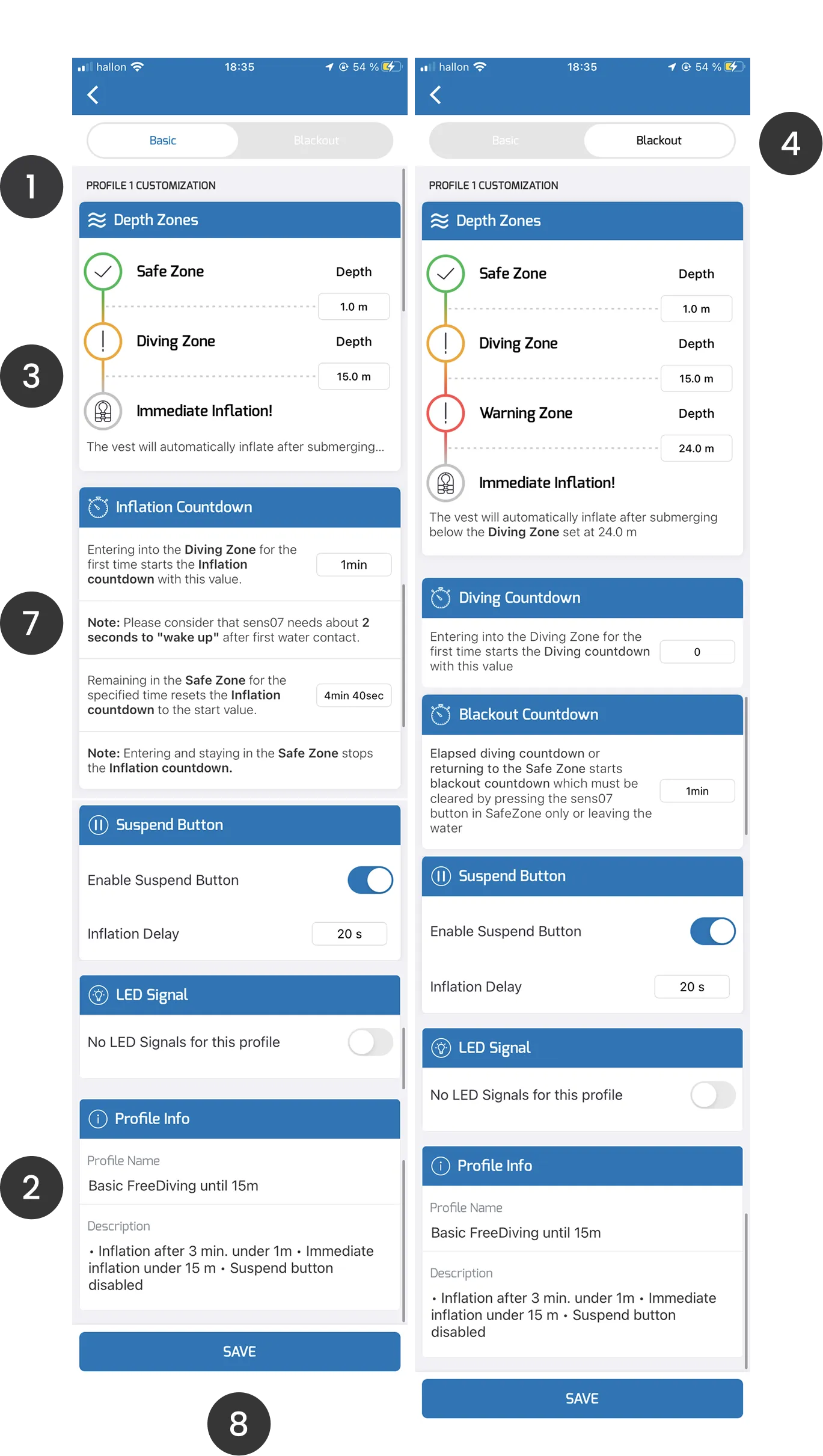
Profile customisation page

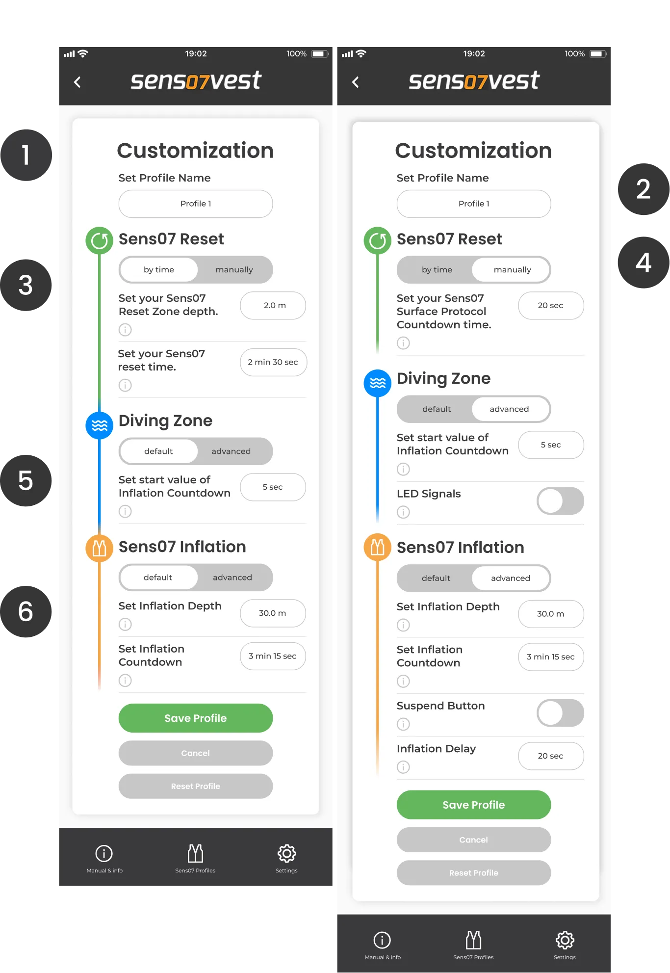
Comments on the changes I made, and why.

  1. A larger headline for better visual hierarchy.
  2. The profile name setting moved to the top, so users understand they can customise it.
  3. The visual icons now run down the whole page, and the settings sit in the group they belong to.
  4. “Blackout” is renamed “Sens07 Reset – manually”.
  5. In Reset you choose by time or manually. In Diving and Inflation you choose default or advanced.
  6. Every setting has an info button. That makes the whole interface easier to read, and users will most likely only need it the first few times.
  7. The “wall of text” is gone, for a lower cognitive load.
  8. A shorter interface that’s easier to use.
The previous profile customisation pages
The new profile customisation page

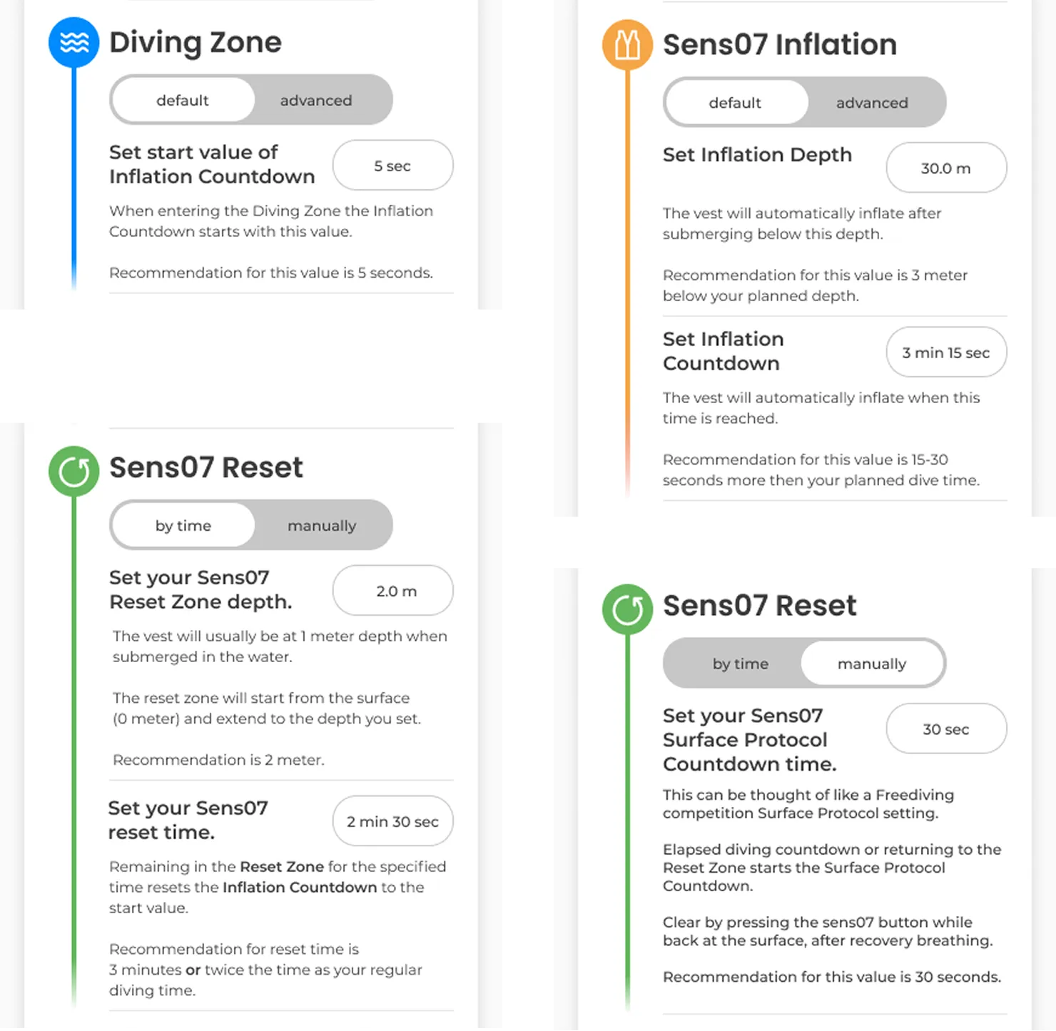
A help text for every setting

I wrote a new help text for each setting, shown when the user taps the info button.

Since the vest is used for safety during underwater sports, and some users aren’t experienced enough to know which settings to choose, I included a recommendation for each setting.

Help texts with recommendations for four settings

More projects

See more

Contact

Let’s talk

Do you want more peace of mind knowing that your products create a high retention? Send me a message and I’ll get back to you.

Sofia Bågenholm

Sofia Bågenholm

Designer & Founder, Polu Design AB

Gothenburg, Sweden / Remote

I only use your details to reply to your message.